Guide to Neutral & Muted Pastel Spaces: Living Room and Bedroom Edition
Lexangrit Editorial Team
August 3, 2026
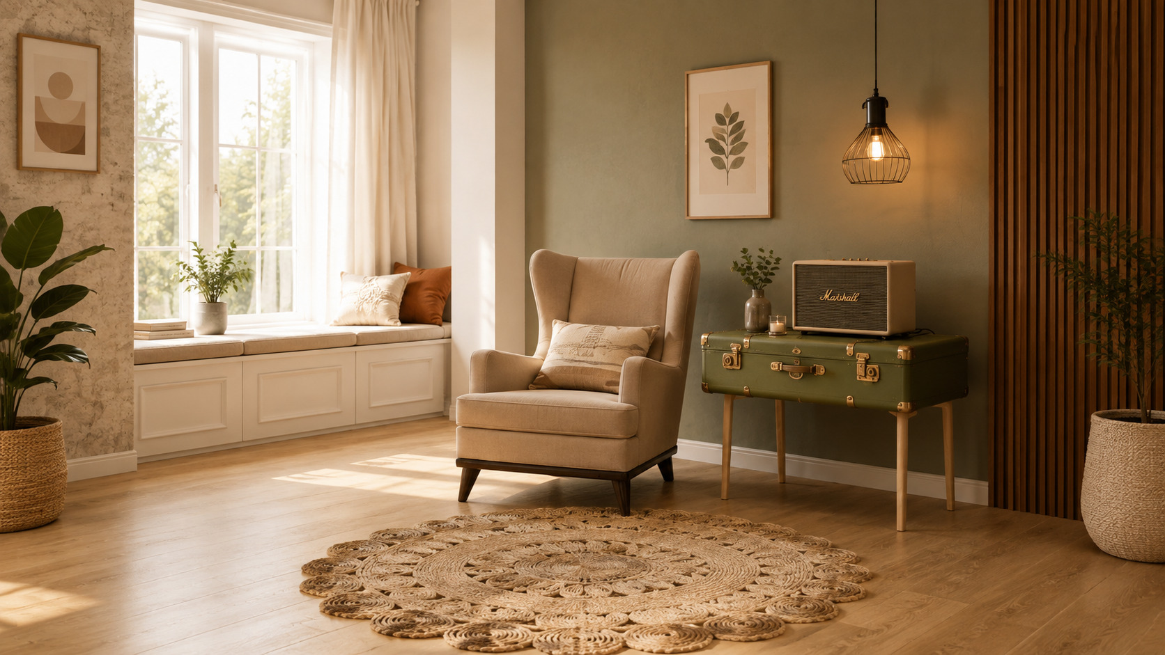
Ever walked into a room that instantly made you feel calm, comfortable, and completely at home? Chances are, it wasn't because of bright colors or extravagant décor—it was the thoughtful use of neutral tones and muted pastel shades. These color palettes have become a favorite among homeowners and interior designers because they create spaces that feel timeless, elegant, and welcoming. Unlike bold color trends that may lose their appeal over time, neutral and muted pastel interiors offer lasting beauty and flexibility. They provide the perfect backdrop for different furniture styles, natural textures, and seasonal décor updates while maintaining a peaceful atmosphere. Whether you're renovating your home or simply looking for fresh decorating ideas, incorporating these soft hues into your living room and bedroom can transform your interiors into relaxing retreats. This guide explores everything you need to know about designing beautiful neutral and muted pastel spaces, from choosing the right color palette to selecting furniture, lighting, textures, and accessories that bring warmth and personality to your home. This featured image is a part Image base
Plan Your Interior Budget
Wondering what your Interior Design interior will cost? Get an instant estimate with our free Interior Cost Calculator — no sign-up needed.
What Are Neutral and Muted Pastel Colors?
Neutral colors are timeless shades that serve as the foundation of interior design. They include white, ivory, cream, beige, taupe, greige, light gray, and soft brown. These colors create a clean and sophisticated backdrop while making rooms appear larger and brighter. Muted pastel colors are softer versions of traditional pastel shades. Instead of vibrant pinks, blues, or greens, muted pastels have earthy undertones that make them subtle and elegant. Popular muted pastel shades include sage green, dusty rose, pale lavender, muted peach, powder blue, and soft olive. When combined, neutral and muted pastel colors create interiors that feel balanced, warm, and effortlessly stylish.
Why Neutral Interiors Never Go Out of Style
Interior design trends change every year, but neutral spaces continue to remain popular because they offer unmatched versatility. A neutral room can easily adapt to changing décor styles without requiring a complete makeover. Soft colors also allow natural light to reflect throughout the room, making even compact spaces feel open and airy. They provide a calming environment that promotes relaxation, making them ideal for living rooms and bedrooms where comfort is essential. Another advantage is their ability to complement almost every furniture material, including wood, marble, glass, metal, rattan, and linen. This flexibility allows homeowners to update accessories or artwork without changing the entire room.
Creating a Warm and Inviting Neutral Living Room
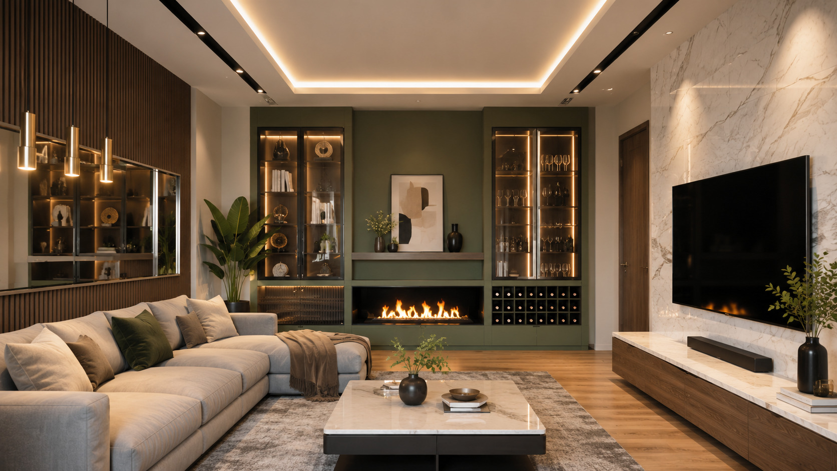
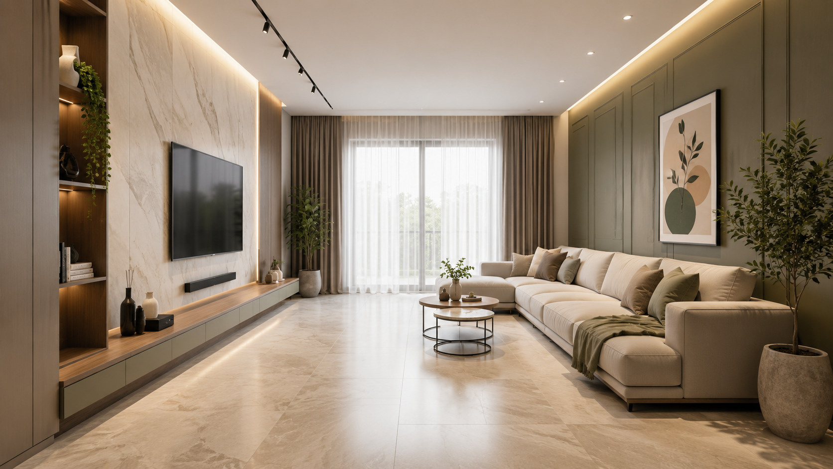
Your living room is where family and friends gather, making comfort just as important as style. Begin with a neutral foundation by selecting warm white, cream, or beige walls. These shades create a bright backdrop that allows furniture and décor to stand out naturally. A comfortable sofa in ivory, greige, or light gray serves as the centerpiece of the room. Pair it with cushions in muted pastel tones such as sage green, dusty pink, or powder blue. Instead of using bold patterns, focus on subtle textures that add visual interest. Wooden coffee tables, woven baskets, ceramic planters, and natural fiber rugs introduce warmth while maintaining the simplicity of the design. Indoor plants further soften the space and bring a refreshing connection to nature. Large windows with sheer curtains allow sunlight to enhance the neutral palette throughout the day. During the evening, warm lighting from floor lamps and table lamps creates a cozy ambiance that makes the room feel even more inviting.
Designing a Peaceful Neutral Bedroom
The bedroom should be a sanctuary where you can unwind after a long day. Neutral colors naturally encourage relaxation by reducing visual distractions. Start with soft white or cream walls and choose a wooden or upholstered bed frame in beige or taupe. Layer crisp white sheets with linen duvet covers, knitted throws, and pastel cushions to create a luxurious hotel-inspired appearance. Muted pastel colors work beautifully through bedding, artwork, curtains, or decorative accents. A pale sage blanket, dusty rose cushions, or soft lavender wall art introduces subtle color without disturbing the room's peaceful atmosphere. Minimal bedside tables, warm bedside lamps, and natural wood furniture complete the design while keeping the space uncluttered and functional.
Choosing the Perfect Neutral Color Palette
Selecting the right shades is essential for creating harmony. Instead of relying on a single color, combine multiple neutral tones with one or two muted pastel accents. Warm whites pair beautifully with sage green, while cream works well with dusty rose or muted peach. Beige complements pale blue and soft olive, whereas greige looks sophisticated alongside lavender or muted terracotta. The goal is to create gentle contrast while maintaining visual balance throughout the room.
Add Character Through Texture
One of the biggest misconceptions about neutral interiors is that they appear plain. In reality, texture is what gives these spaces depth and personality.
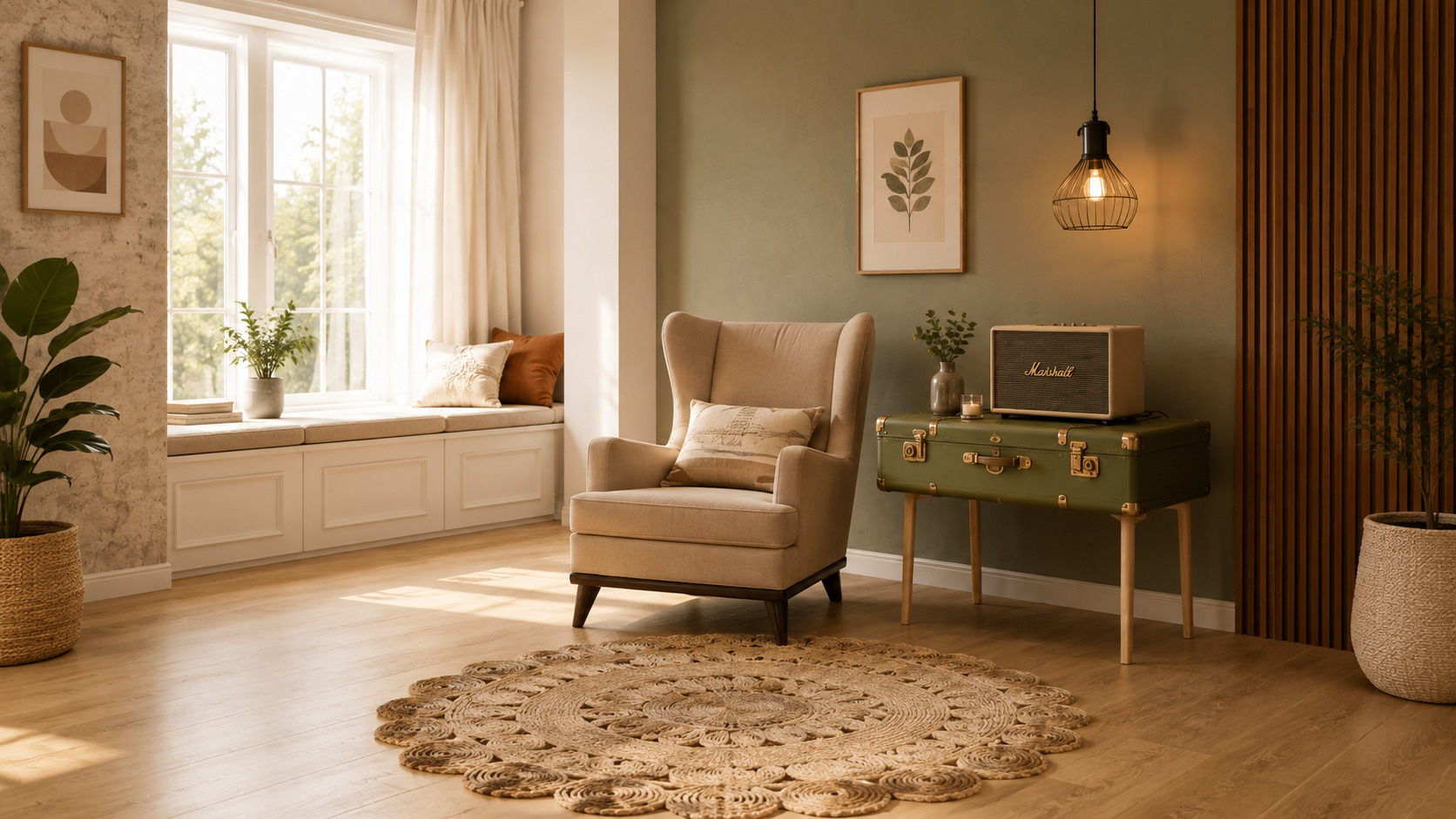
Combine soft linen curtains with boucle chairs, woven baskets, chunky knit blankets, cotton cushions, jute rugs, and handcrafted ceramic accessories. Wooden furniture with visible grain patterns introduces natural warmth, while marble surfaces add understated elegance.
Layering different materials prevents the room from looking flat, even when the overall color palette remains subtle.
A Home That Feels Good Is More Beautiful Than One That Simply Looks Good
Beautiful interiors aren't created by purchasing expensive furniture or following every design trend. They come from thoughtful choices that make everyday living more comfortable. Neutral and muted pastel spaces encourage slower, more mindful living by reducing visual clutter and creating an environment where you can truly relax.
The Importance of Natural Light
Natural light transforms neutral interiors. Soft colors reflect daylight more effectively than darker shades, making rooms appear larger, brighter, and more welcoming. If possible, maximize sunlight by using sheer curtains instead of heavy drapes. Position mirrors opposite windows to reflect natural light deeper into the room. Glass décor, metallic accents, and light-colored furniture also help brighten the space naturally. In the evening, switch to warm LED lighting rather than cool white bulbs. Warm lighting enhances beige, cream, and pastel shades, creating a cozy atmosphere that feels inviting year-round.
Decorating with Minimal Accessories
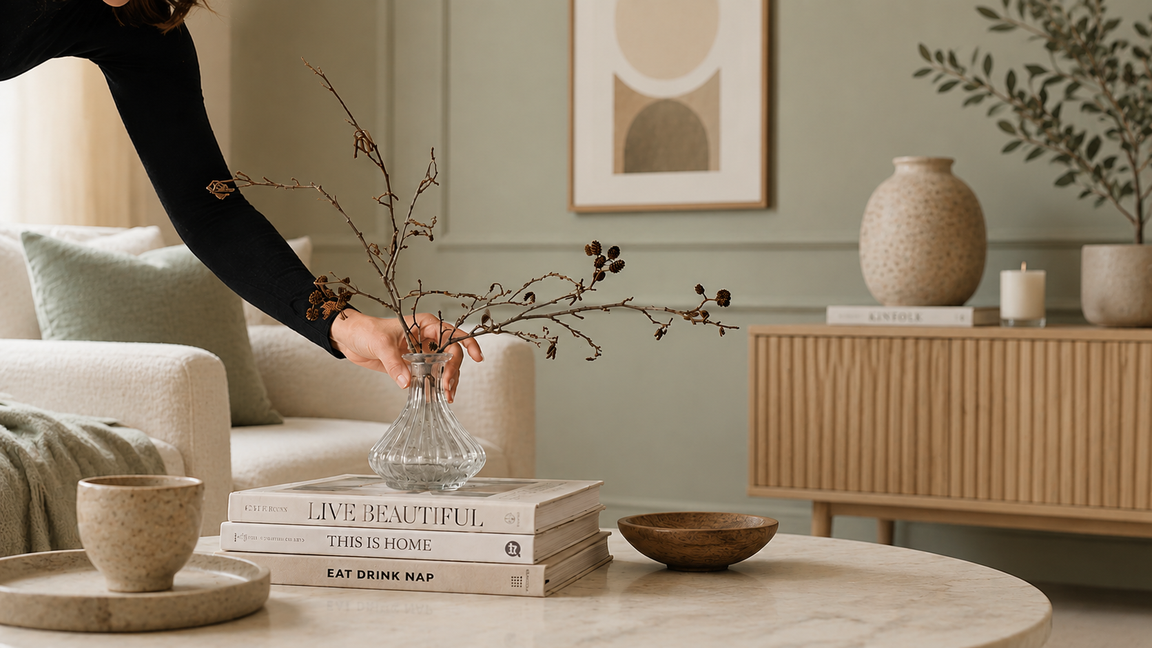
Neutral interiors embrace the philosophy that less is more. Instead of filling every shelf with decorative objects, carefully select a few meaningful accessories. Consider styling your room with ceramic vases, coffee table books, candles, framed artwork, woven trays, dried flowers, or handcrafted sculptures. Leaving empty space around decorative items allows each piece to stand out while maintaining the calm aesthetic that neutral interiors are known for.
"The earth has music for those who listen." — William Shakespeare
This timeless quote reminds us that beauty often exists in simplicity. Just as nature creates harmony through subtle colors and textures, a thoughtfully designed neutral interior can feel peaceful without relying on dramatic contrasts.
Common Mistakes to Avoid
Many homeowners make the mistake of using only one neutral shade throughout a room. While the intention is to create simplicity, the result can feel flat and uninspiring. Instead, layer different neutral tones such as ivory, cream, beige, taupe, and greige to create depth. Another common mistake is ignoring texture. Without varied materials like wood, linen, boucle, cotton, or natural stone, neutral spaces can lose their visual interest. Overdecorating is another issue. Too many accessories make even the calmest color palette feel cluttered. Remember that empty space is an important part of good design. Lastly, avoid harsh white lighting, which can make neutral colors appear cold. Warm lighting brings out the richness of soft shades and enhances the overall atmosphere.
Refresh Your Home with Seasonal Updates
One of the greatest benefits of neutral interiors is how easily they adapt to changing seasons. During spring, decorate with fresh flowers and pastel cushions. Summer calls for lightweight linen fabrics and woven accessories that create an airy feel. Autumn is the perfect time to introduce warm terracotta ceramics, textured blankets, and wooden accents. Winter becomes cozy with chunky knit throws, candles, soft rugs, and warm lighting. Since the foundation remains neutral, these seasonal changes require minimal effort while keeping your home fresh all year long.
Sustainable Decorating with Neutral Interiors
Neutral spaces naturally encourage mindful decorating because they focus on quality over quantity. Investing in durable wooden furniture, timeless upholstery, and handcrafted décor reduces the need for frequent replacements. Natural materials like cotton, wool, jute, bamboo, linen, and solid wood not only age beautifully but also contribute to a healthier indoor environment. Instead of replacing furniture every few years, neutral interiors allow you to refresh your home simply by changing cushions, artwork, or decorative accessories.
Final Thoughts
Neutral and muted pastel interiors prove that elegance doesn't require bold colors or complicated design. By combining soft color palettes with natural textures, warm lighting, comfortable furniture, and thoughtful décor, you can create living rooms and bedrooms that feel both sophisticated and inviting. Whether your style leans toward Scandinavian, Japandi, minimalist, contemporary, or modern farmhouse, these timeless colors provide endless opportunities to personalize your space without sacrificing comfort. Sometimes, the quietest colors create the strongest impression. A well-designed neutral room doesn't just look beautiful—it feels like home.
Frequently Asked Questions (FAQs)
1. What colors are considered neutral in interior design?
Neutral colors include white, cream, ivory, beige, taupe, greige, light gray, and soft brown. These shades create a timeless foundation that complements almost every décor style.
2. What are muted pastel colors?
Muted pastels are softened versions of traditional pastel shades. Popular options include sage green, dusty pink, pale lavender, powder blue, muted peach, and soft olive.
3. How can I make a neutral room feel cozy?
Layer different textures such as linen, wool, cotton, boucle, wood, and woven materials. Add warm lighting, soft rugs, cushions, and indoor plants to create a welcoming atmosphere.
4. Are neutral interiors suitable for small rooms?
Yes. Neutral colors reflect natural light, making smaller rooms appear larger, brighter, and more open.
5. Which interior styles work best with neutral and muted pastel colors?
These colors pair beautifully with Scandinavian, Japandi, minimalist, contemporary, modern farmhouse, coastal, and transitional interior styles.
6. How do I add color without overpowering a neutral room?
Use muted pastel shades through cushions, throws, artwork, curtains, vases, or decorative accessories. These accents add personality while preserving the room's calm and balanced appearance.
7. Is a neutral color palette difficult to maintain?
Not at all. By choosing washable fabrics, durable materials, and timeless furniture, neutral interiors are easy to maintain and adapt to changing trends with simple accessory updates.